Nonprofit design · Inspiration gallery
Best Nonprofit Website Examples: 18 Sites Worth Studying in 2026
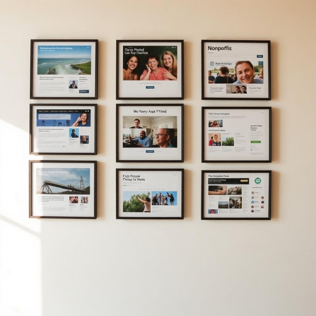
A curated list of nonprofit websites worth studying in 2026 — organized less as a beauty contest and more as a set of benchmarks. For each site, we call out the one decision it gets right that most nonprofit sites still get wrong.
How we picked these sites
Every site on this list clears four bars: a story-led homepage that names a real person or place; a donation flow that matches the promise of that story; visible accessibility work (contrast, keyboard support, alt text); and a content cadence a small team can actually maintain. Pretty sites that fail two or more of these bars didn't make the cut.
The gallery
Global · Water
charity: water
The gold standard for donation-page conversion. Monthly giving is the default, presets tie to a specific outcome, and the 100% model is stated on every page — not buried in an FAQ.
Global · Education
Pencils of Promise
Program pages open with a named student and a specific school, not a mission statement. Impact data supports the story below the fold — never in place of it.
US · Youth mental health
The Trevor Project
A crisis-services CTA that follows you across every page without becoming visual noise. A textbook example of primary-action hierarchy on a nonprofit site.
US · Food security
Feeding America
Local-food-bank locator front and center. Turns a national brand into a hyper-local next step in one click — the pattern most large nonprofits still get wrong.
Global · Children
Save the Children
Emergency-response modules that swap in during crises without breaking the site's architecture. Watch how the top-of-page banner adapts by campaign, not by season.
Global · Health
Doctors Without Borders
First-person field reports drive most program pages. Copy voice sounds like the people doing the work — because it is the people doing the work.
Global · Environment
The Nature Conservancy
Long-form storytelling and interactive maps sit alongside a clean giving flow. A model for orgs whose credibility depends on evidence and scale.
Global · Literacy
Room to Read
Annual-report content is treated as a homepage-quality product, not a downloadable PDF. Data storytelling that actually earns time on page.
US · Youth writing
826 National
Playful, illustrated design proves nonprofit doesn't have to mean neutral. The visual system is opinionated — and legible — everywhere it goes.
Global · Micro-loans
Kiva
One of the few nonprofits where the product is the story. Borrower profiles are the primary content type, not a supporting one.
Global · Girls' education
Malala Fund
A tightly designed one-issue nonprofit site. No page competes with the mission. A useful benchmark for orgs debating scope creep.
Global · Healthcare
Watsi
Radical financial transparency — every patient's treatment cost is public. A masterclass in trust-building through UX.
US · Public schools
DonorsChoose
The best implementation of 'browse a real project, fund a real project' on the internet. Filter UX is worth studying line by line.
US · Justice reform
The Bail Project
Data journalism woven into program pages. Every claim has a source, and the site design makes that credibility feel effortless rather than defensive.
US · Gender-based violence
Sanctuary for Families
Safety-first UX for a sensitive audience: quick-exit button, accessible reading level, and clear service pathways for people in crisis.
US · Public health
GirlTrek
Community-first design. Membership feels like joining a movement, not signing a mailing list. Notice how testimonials do the recruiting.
Global · Housing
Habitat for Humanity
A large federated nonprofit that still ships a coherent brand across hundreds of affiliates. A rare, working example of a distributed design system at scale.
US · Journalism nonprofit
The Marshall Project
Newsroom-grade typography and reading experience on a nonprofit budget. The kind of quality bar every mission-driven publisher should measure against.
What to do with this list
Pick three sites that share your scale — not your ambition — and use them as your comps. Note what they do in the first fold, on the donation page, and in their footer. That's your working spec. Everything else is decoration.
FAQ
What makes a nonprofit website 'the best'?
The strongest nonprofit websites share four traits: a specific, human story on the homepage; a donation flow that matches the emotional promise of the story; clean accessibility (contrast, keyboard, alt text) baked in from day one; and a content system a two-person team can actually run. Aesthetics matter, but they're a byproduct of these four choices — not a substitute.
Should we copy any of these designs?
No — copy the decisions, not the pixels. Notice why a site opens with one child's story instead of a mission statement, or why a donation page defaults to monthly giving. Those decisions travel to any brand. Copying a specific layout tends to produce something that looks like a knockoff and behaves like one.
How often should a nonprofit redesign its website?
Most healthy nonprofits refresh content quarterly and rebuild the site every four to six years. If your site is older than that, if the donation flow lives on a separate platform that looks nothing like the rest of the site, or if you dread linking to your program pages in an email — it's time.
Do small nonprofits need this level of polish?
Yes, but 'polish' is smaller than it sounds. A one-page site with a clear promise, one strong story, and a monthly-giving-first donation form outperforms a fifteen-page site with generic stock photos and a scattered ask. Small is fine. Vague is what kills nonprofit sites.
Want a site that belongs on a list like this?
Creative Lift builds nonprofit websites that clear all four bars above — story-led, donation-ready, accessible, and maintainable by a small team.
See our nonprofit website design service →Further reading
From Creative Lift
- Nonprofit website audit checklist — turn inspiration into a scored list of fixes for your own site.
- Best nonprofit website templates — build vs. buy, and when a template gets you most of the way there.
Outside resources
- WCAG accessibility guidelines — the accessibility bar these sites are being measured against.
Related posts
Best Nonprofit Websites of 2026: 12 Standouts and Why They Work
Our 2026 shortlist — twelve standout nonprofit websites scored on story, donation flow, accessibility, and maintainability.
Read →Best Nonprofit Website Templates (2026): Build vs. Buy Guide
Compare the best nonprofit website templates on Webflow, WordPress, and Framer — and when custom design pays off.
Read →Nonprofit Website Design Guide: Best Practices for Mission-Driven Sites
UX, accessibility, mobile responsiveness, donation flow, and storytelling for mission-driven organizations.
Read →